Apple’s new Dashboard Widgets bother me. Not in a usability sense — they look quite useful, especially if they can be brought in and out of view quickly. What bothers me is that every widget looks completely different. Reading about user interfaces, the one clear mantra appears to be “consistency, consistency, consistency.” The Dashboard has inconsistency all over the place. Widgets have different colors, different borders, and even different GUI controls. Furthermore, the whole concept of a Widget breaks the consistent idea of what an application is.
 Now, I’m not a Mac user. But a friend who is explained why she likes the Widget concept: things that are different should look different. So, I asked, does that mean that a window containing a web browser should look different from a window containing a word processor? Yes, she said.
This certainly makes writing window managers a lot more challenging. But it makes sense. A music player and an FTP client have almost nothing in common, so why should they have similar interfaces?
What it boils down to is this: some people “see the interface” and others don’t. A programmer or designer can look at an application interface and think, “Okay, that’s a combo box, that’s an adjustable frame border, that’s a button.” But users only see words, colors, and shapes. They know that clicking the mouse on certain words or shapes will produce a given effect, but they rarely understand the difference between, say, an icon on the desktop and a button on the toolbar. Why do you double-click the former but single-click the latter? Who knows. I’ve seen plenty of regular computer users who double-click everything, just in case.
(Update 26 July 2007: On second read, that was pretty rude of me. My point is not that users are stupid — it’s that no one should have to think about the difference between an icon on the desktop and a button on the toolbar. You should just be able to get on with whatever you’re doing.)
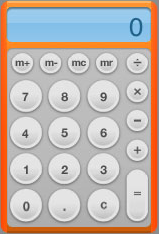
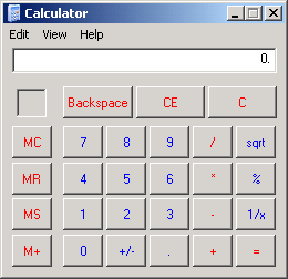 Getting back to Apple’s Widgets, they are all specialized tools. Each does a single task — calculator, address book, weather report, etc. They are not general-purpose applications, so it doesn’t make sense to put them on the same footing in the interface. For example, I almost never use the Windows Calculator because it takes too long to launch and the interface — using the default system font and colors — is hard to read. In contrast, the Dashboard calculator has a larger display and uses standard calculator symbols for multiply and divide rather than * and /. It is less consistent with the rest of the Mac GUI, but is more consistent with our notion of calculators.
So perhaps interfaces should be consistently inconsistent. Turns out there’s even a paper about this, written by Jonathan Grudin in 1989: The Case Against User Interface Consistency.
I know this is old, and you don’t care anymore, but widgets are supposed to look different, so when you open Dashboard, you can see, instantly, where the widget you’re looking for is. As opposed to having 5+ identical windows popup.